SiteSpect Analytics Report
(2019)
| Background: | I'm the principal UX designer at SiteSpect, a web optimization company that offers an A/B testing, personalization, and recommendations platform. |
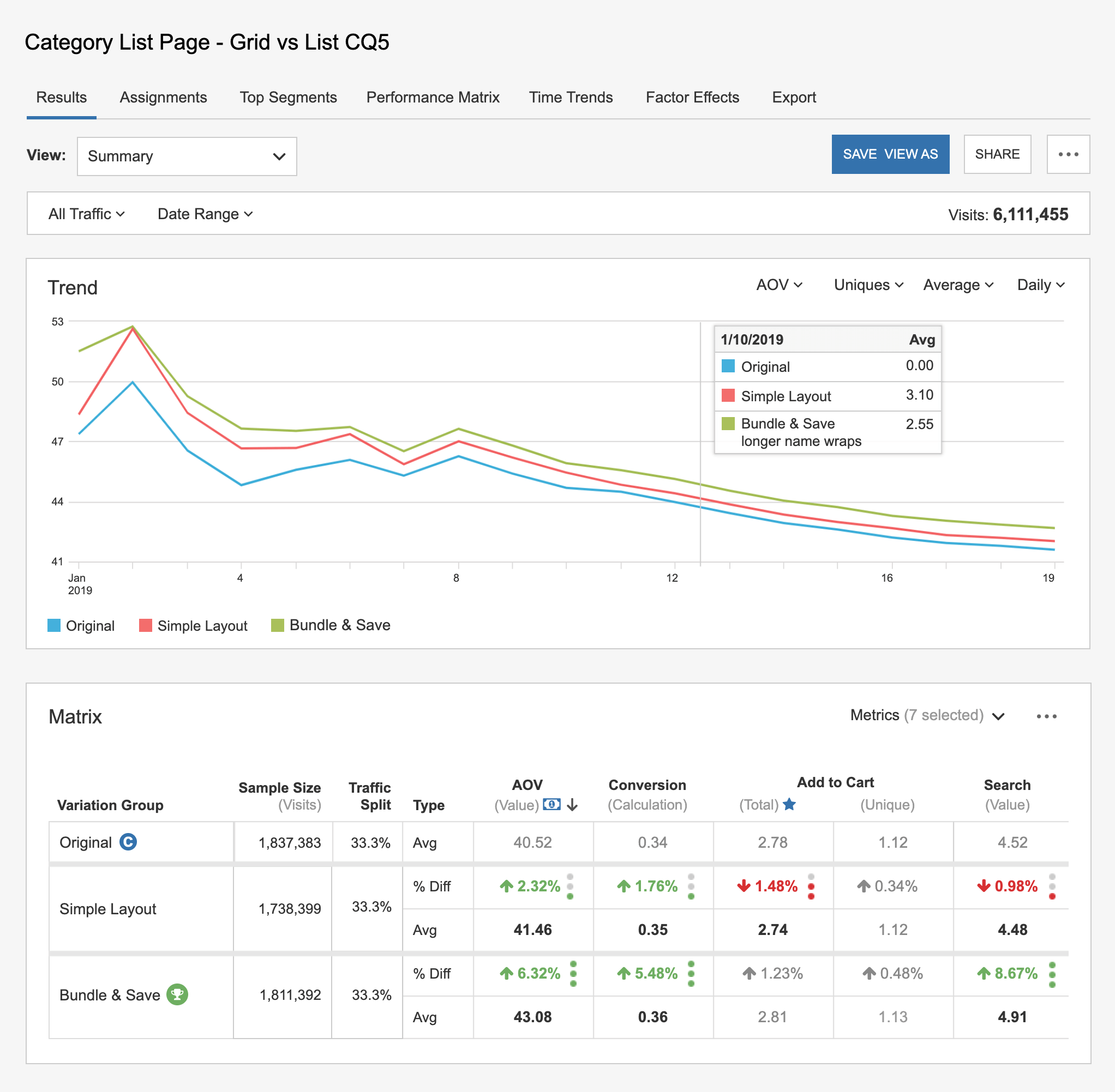
| Problem: | SiteSpect's main campaign analytics report had many usability problems, including an overly dense tabular view with tiny font, left/right scrolling without sticky row headings, and no visualization option. It looked outdated. Users frequently said that this report scares them because it has so many numbers, and they want a way to see the information visually. |
| Solution: | I designed a new analytics report that shows results in both a graph and a table. It provides many customization options. The overall presentation feels fresh and easy to use. |
The new report:
The old analytics report that users struggled with:
